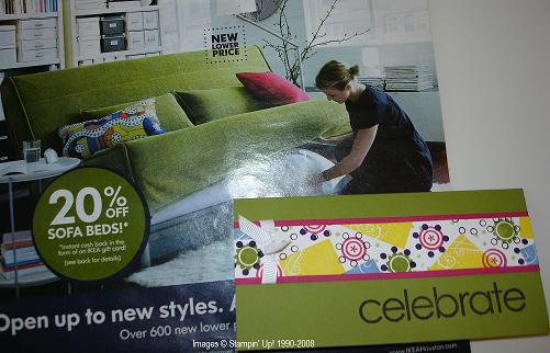
 Recently I began taking an online course on card design by Julie Ebersole at My Creative Classroom.
Our first lesson was about "Inspiration", wherever you find it…I happened to find mine in an IKEA ad that came in the mail! I’ve seen a lot of green in stores and ads and magazines lately.
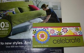
The first photo is my "safe" choice with tying just a white ribbon around the strip, but what I really wanted to do is the second photo with the flower. I received several favorable comments on it so I guess it was okay!
I used several stamp sets on the strip, as well as the flower!
Which one do you like better? See if you can find something to inspire the look of your next card!


Great cards! I love the second one – it really takes it to a new level. Great job! This makes me want to look into the class 🙂
Thanks, Karen! I think Julie is offering that class again so check it out!
Thanks, Cindy! You’re right about using “Little Pieces”. The circles and dots are from “Polka Dots and Petals” and the square is actually from “Priceless”. That lesson was fun to do and I still have magazine pictures torn out that I feel could “inspire” a card.
Oh Karen… Love it! Just wondering what stamp set you used in the white part. I recognize Little Pieces, but there are circles and dots around some of them…? The yellow could be any square solid type of stamp, so don’t need to know that one. I have already forwarded a link to this page to my stampers. Thanks!