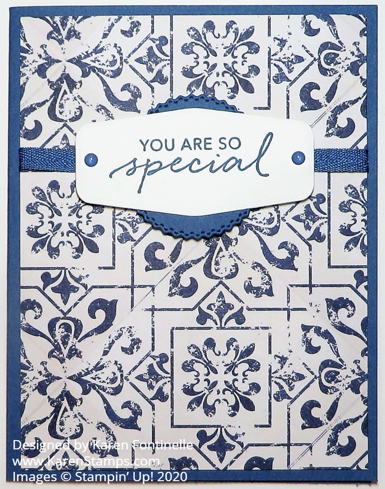
Here is a very simple card that I made with a new color, new designer paper, new stamp set, new die, and new ribbon! Oh, and new enamel dots! However, I did choose the wrong coordinating color, but as you can see, I think it is a close enough match no one will notice! I didn’t!
This blue pattern of paper comes in the In Good Taste package, a really big package of designer paper of photographic images of different textures. And I mean realistic looking images! As I was cutting up this paper, I thought there was a wrinkle or something in the paper, but its just part of the look of the paper. And as I was applying adhesive to the backside of the paper, which is a woodgrain, there was a line in the pattern that I had to touch to make sure it wasn’t sticking up or that something hadn’t gotten on the paper!
The In Good Taste Designer Series Paper has 24 sheets of paper, 2 each of 12 designs. You get images of brick, wood, tile, stone, even ones that look like fabric. Honestly, when I first saw it in the catalog I wasn’t interested, but then I changed my mind when I saw cards other Demonstrators were making and had to have it. I think you will find it will create a lot of texture and interest to use in your cardmaking and other projects.
To make this card, I used a card base of one of the new In Colors, Misty Moonlight to coordinate, I thought. As I found out later, when I looked on the back of the In Good Taste package, the blue coordinating color is Night of Navy. The only thing I noticed was when I stamped a flower from the Tasteful Touches Stamp Set in Misty Moonlight to put on this card somewhere, somehow I didn’t think it looked quite right and didn’t use it. Maybe it was just the card design or maybe it was the color.
I liked the look of this blue pattern in the designer paper and adhered a bit of Misty Moonlight Ribbon around the card before adhering. I realized I usually put the greeting near the bottom of the card, but this time I moved it up near the top. The greeting is stamped from the Tasteful Touches Stamp Set and die cut with the Tasteful Labels Dies. There were several choices there to use! I thought maybe there should be a layer behind the Whisper White greeting and then I noticed the round die-cut in the same Tasteful Labels Dies and used that for just that little bit of color behind the greeting.
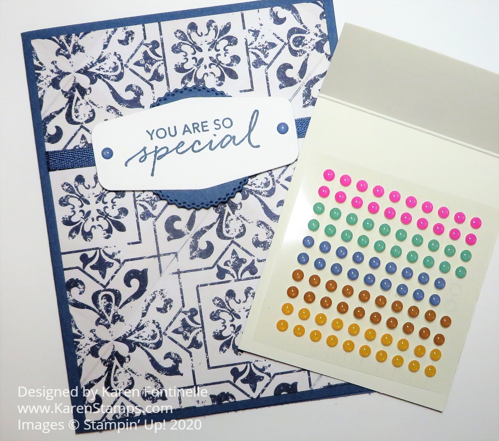
And for just a little bit of embellishment that seemed to really finish off the card, I used two of the Misty Moonlight In Color Enamel Dots on the greeting.
When I opened the package of those enamel dots, I just thought the colors were stunning! Maybe it is the bright Magenta Madness! I took a photo with the dots next to the card although the photo doesn’t quite do them justice. The dots are currently unavailable, however, as I write this.

As you look through the new Stampin’ Up! Catalog, check out the In Good Taste Designer Series Paper. You might be surprised that it appeals to you as it did to me with this In Good Taste You Are So Special Card.
